In the fast paced world of Software as a Service, your website is more than a digital brochure. It is your primary sales engine, product demo, onboarding experience, and brand story all in one place. As we move into 2026, SaaS companies face increasing pressure to communicate complex value propositions quickly, build trust instantly, and convert visitors into users within seconds of landing on the page.
In this exclusive roundup, we present the Top 10 Software as a Service Website Designs of 2026, carefully reviewed and ranked by the team at WebXd, a web design agency based in La Jolla, California. Our evaluation goes far beyond surface level visuals. We analyze clarity of messaging, user experience, performance, scalability, accessibility, and the thoughtful use of interactive elements that elevate the customer journey.
From bold product storytelling and seamless navigation to high converting landing pages and frictionless signup flows, the websites featured here represent the very best in modern SaaS design. Each one demonstrates how strategy, creativity, and technology can come together to drive growth and engagement in a highly competitive market.
Let’s explore the SaaS websites that are setting a new benchmark for innovation, usability, and digital excellence. Here are our top picks.
#1: Mural
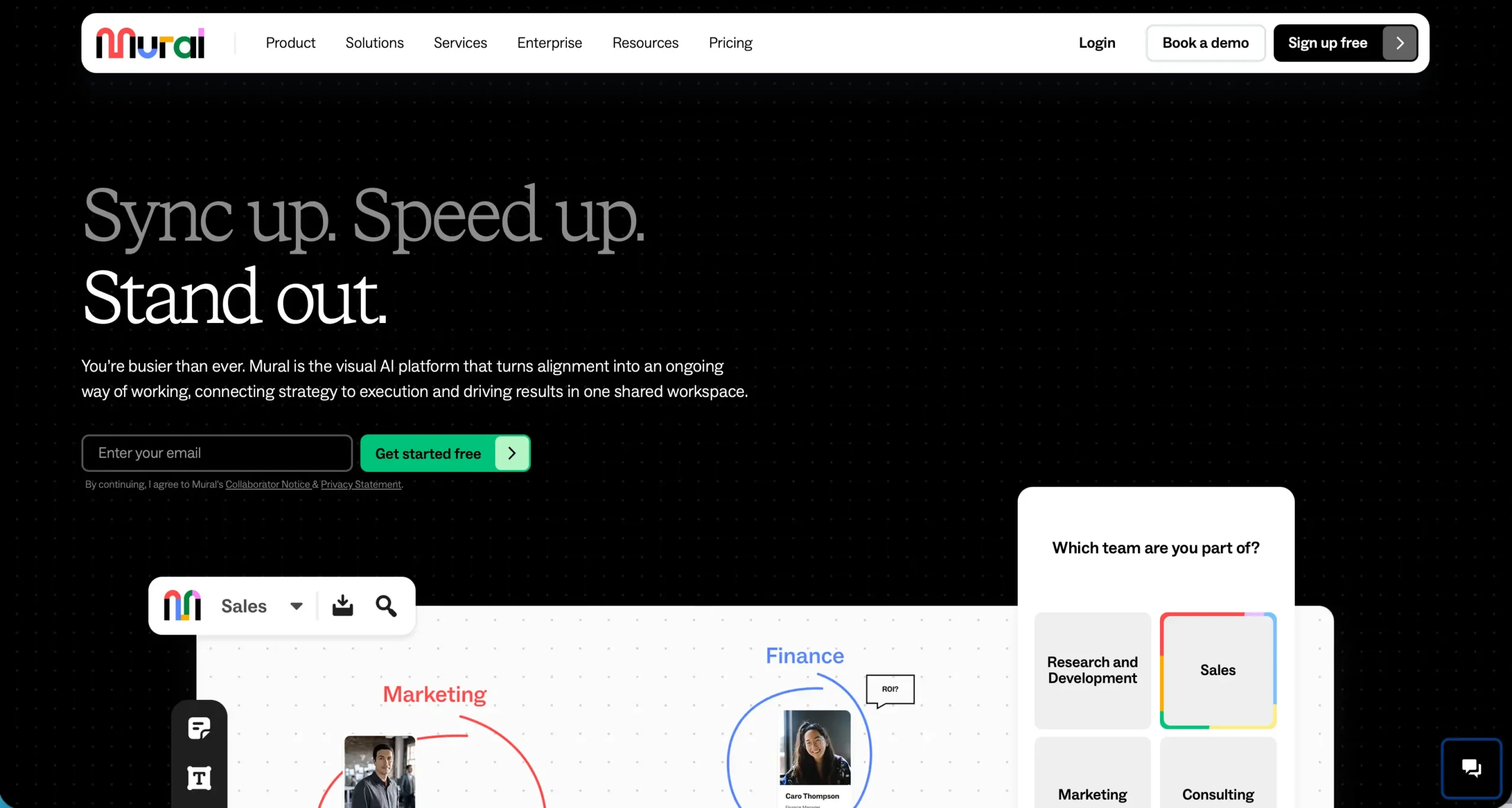
Website: https://www.mural.co
Mural’s website immediately sets the tone with a clean, engaging visual workspace that reflects the product experience itself, blending clarity with purpose. The layout smoothly guides visitors from high level value propositions into tailored use cases for teams in research, sales, marketing, and consulting, making it easy to understand who the product serves and how it helps drive outcomes. Key elements like real-time collaboration visuals, intelligent AI features, and seamless integration options are presented in a way that feels both modern and functional, encouraging deeper exploration with strong calls to action throughout. The site also builds trust through recognizable customer logos and metrics that reinforce Mural’s impact on productivity and teamwork, all wrapped in a design that balances usability with visual appeal.
#2: Guesty
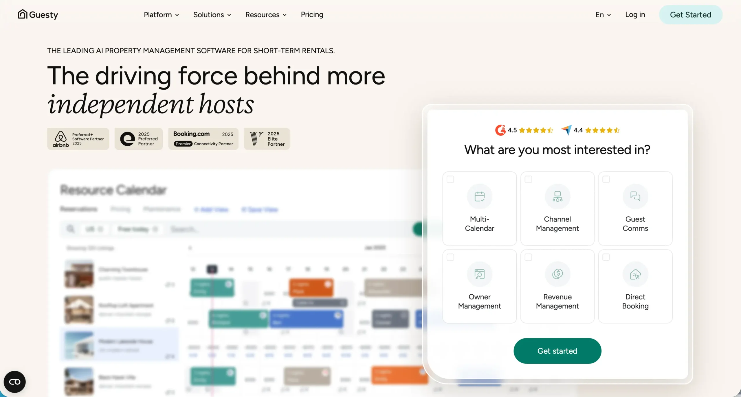
Website: https://www.guesty.com
Guesty’s website makes a powerful first impression with bold visuals and concise messaging that clearly communicate its position as a leader in property management software. From the homepage, visitors are met with strategic sections that highlight core solutions for short term and vacation rental businesses, illustrating how Guesty streamlines operations, automates workflows, and boosts revenue. The design uses clean typographic hierarchy and thoughtfully spaced layouts to break down complex features into digestible insights, while interactive elements and success metrics enhance credibility. Strong calls to action paired with persuasive customer stories and outcome-focused content guide users toward requesting demos or learning more, all without overwhelming the experience. The overall effect is a polished, professional website that aligns with Guesty’s value as an enterprise-grade platform built for growth.
#3: Krisp.ai
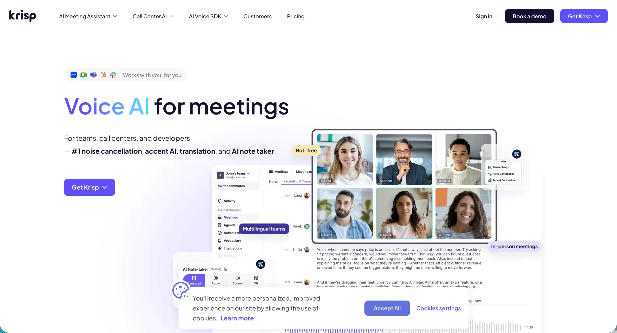
Website: https://krisp.ai
Krisp’s website stands out with a sharp focus on simplicity and performance, mirroring the clarity the product delivers in real time noise cancellation. From the first scroll, visitors are greeted with clean sections that clearly explain how Krisp removes background noise for calls and recordings, supported by strong visuals and straightforward language that cuts through complexity. The site balances informative content with intuitive navigation, showcasing features like AI-powered noise suppression, easy platform integration, and use cases for professionals in remote work, podcasting, and customer support. Testimonials, awards, and usage statistics create trust without clutter, while prominent calls to action gently guide users toward downloads and plans. The streamlined design not only reflects the efficiency of the product but also elevates user confidence from the moment they land on the page.
#4: Airtable
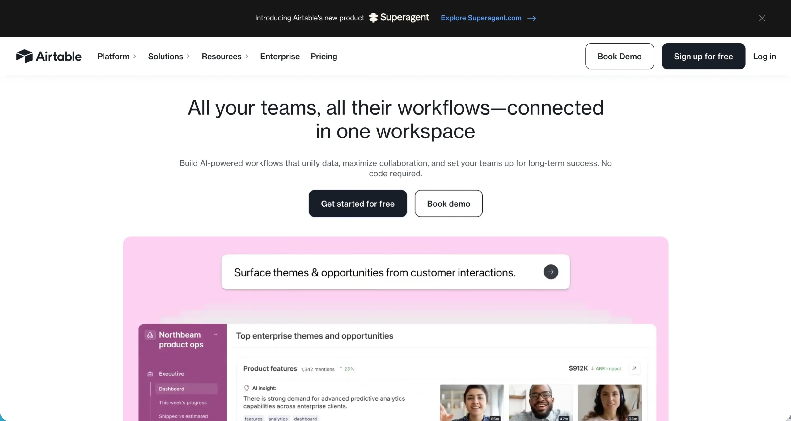
Website: https://www.airtable.com
Airtable’s website excels at communicating powerful flexibility with an inviting, user-centric design that makes a complex product feel accessible to a broad audience. From the moment you land on the homepage, you see compelling examples of how different teams and industries leverage Airtable to build custom workflows, track projects, and automate tasks without code. The site uses vibrant visuals, clear sectioning, and dynamic feature highlights to tell a cohesive story about modularity and scalability, helping visitors instantly grasp the platform’s versatility. Thoughtful use cases, customer success stories, and concise benefit statements build credibility while guiding users toward templates, demos, and trial options. With its blend of clean aesthetics, intuitive navigation, and effective messaging, Airtable’s website not only showcases the product’s strengths but invites exploration in a way that feels both engaging and approachable.
#5: CareStack
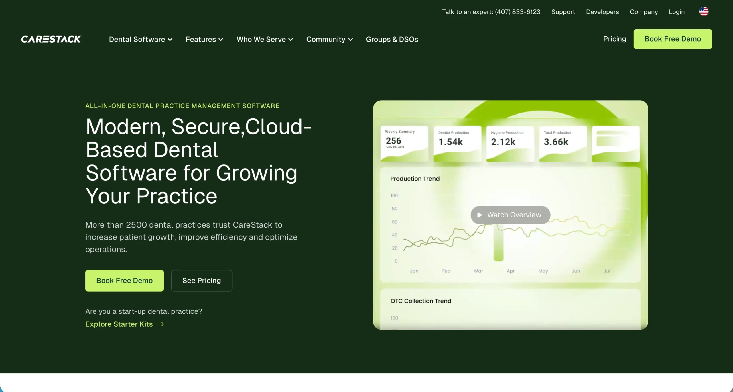
Website: https://carestack.com
Carestack’s website delivers a polished and purposeful first impression, clearly positioning itself as a comprehensive practice management platform for dental providers. The homepage combines compelling visuals with succinct messaging to outline how the software simplifies front office tasks, enhances patient experiences, and drives revenue growth. Strategic sectioning highlights core features like scheduling, billing, and analytics while demonstrating product benefits through real-world context instead of abstract claims. Easy-to-find customer stories and industry recognitions build trust, and consistent calls to action encourage visitors to request demos or explore feature details without friction. Overall the design balances professionalism with clarity, making complex workflows feel approachable and helping dental professionals quickly understand how Carestack can transform their operations.
#6: ServiceNow
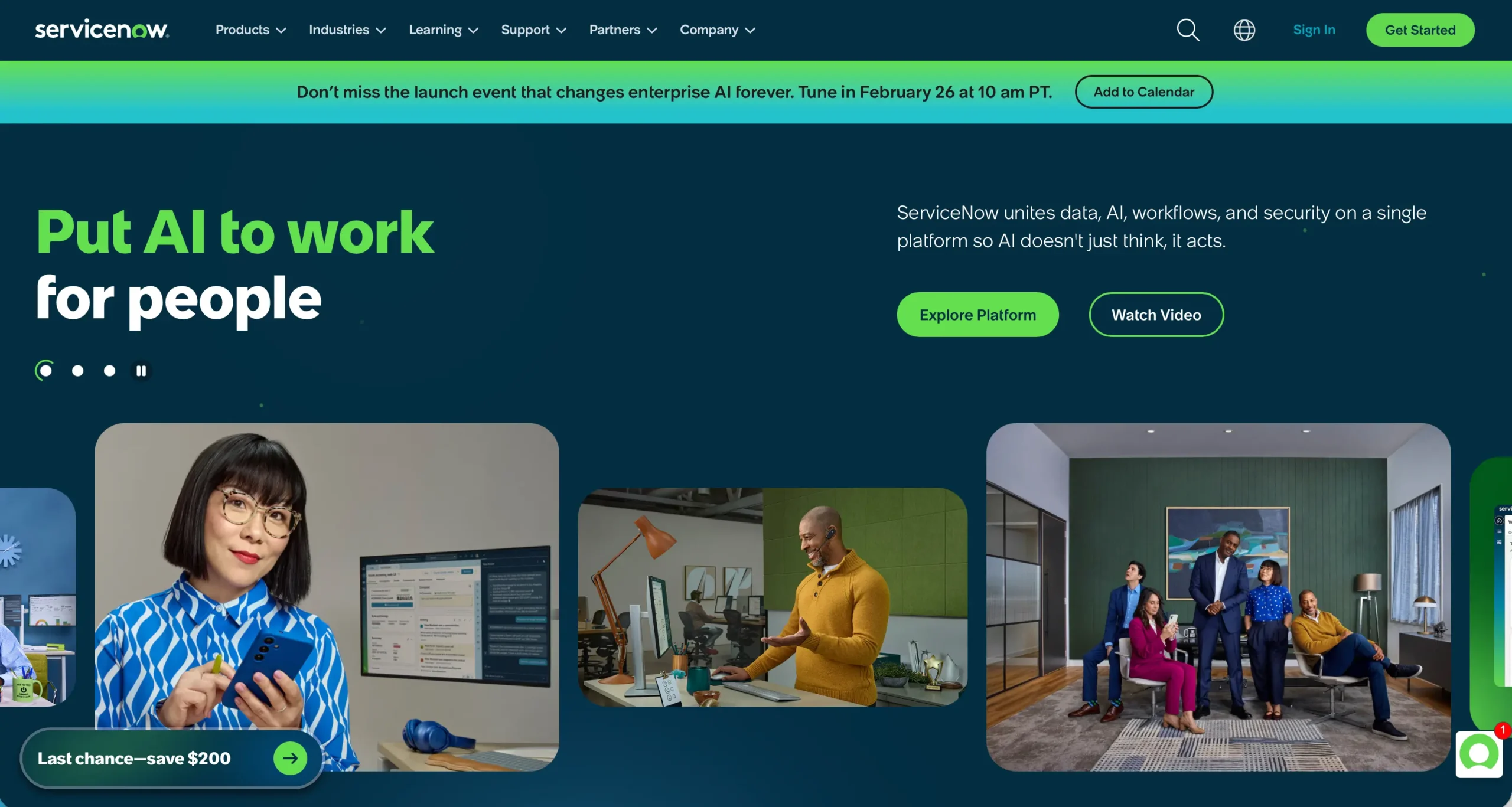
Website: https://www.servicenow.com
ServiceNow’s website creates a commanding presence with enterprise-grade design and clear strategic positioning, reflecting its role as a leading digital workflow platform. From the outset, the homepage communicates value with concise messaging about automating work across IT, employee experience, customer service, and security operations, supported by bold visuals and intuitive navigation. Well-structured sections highlight key solutions and industries, allowing visitors to quickly find relevant insights whether they are in healthcare, finance, government, or another sector. The site effectively integrates customer success stories, thought leadership, and outcome-driven statistics to reinforce credibility, while strong calls to action guide users toward demos, free trials, and resources. With its professional layout, depth of content, and seamless user experience, ServiceNow’s website mirrors the scale and sophistication of its platform, making it easy for prospects to understand the transformative potential of its offerings.
#7: DigitalOwl
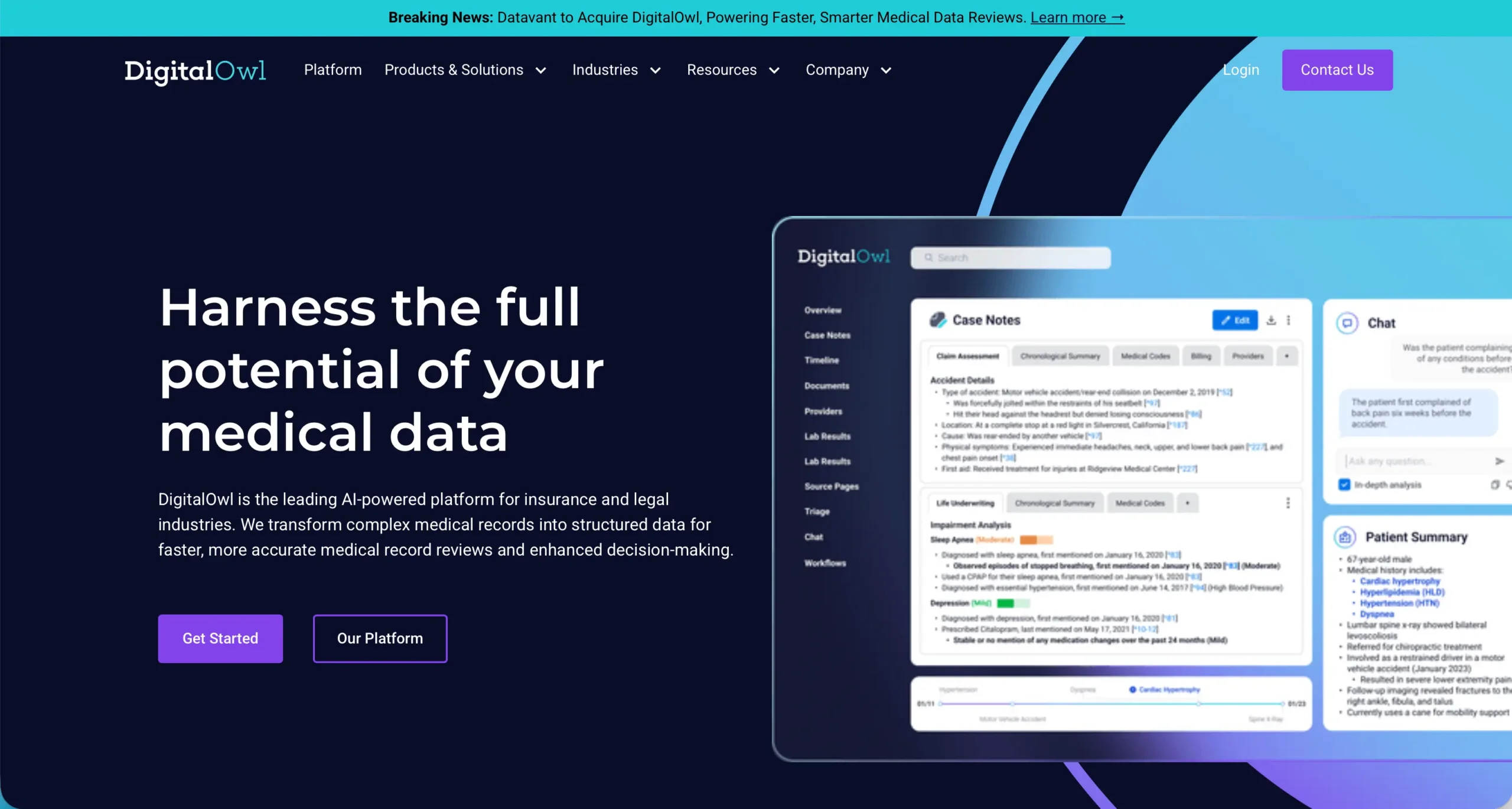
Website: https://www.digitalowl.com
DigitalOwl’s website effectively reflects its position as a forward-thinking AI-driven SaaS solution focused on transforming the way insurance and legal professionals interact with complex medical data. The homepage immediately communicates its core value proposition with concise messaging that explains how unstructured medical records are turned into structured, actionable insights, reducing review time while improving accuracy.
Clean navigation and clearly defined sections guide visitors through product capabilities like automated triage, AI-enhanced summaries, and decision-support workflows, helping users quickly understand how DigitalOwl’s suite of tools can streamline workflows and enhance productivity. Strategic use cases tailored to underwriting, claims processing, and legal reviews make the platform’s benefits tangible for its target audiences, while trust signals and demo prompts are prominently placed to drive engagement without overwhelming the experience. Overall, the design balances informative content with thoughtful layout, showcasing an enterprise-grade tool that delivers clarity, efficiency, and innovation for data-intensive professionals.
#8: Deepnote
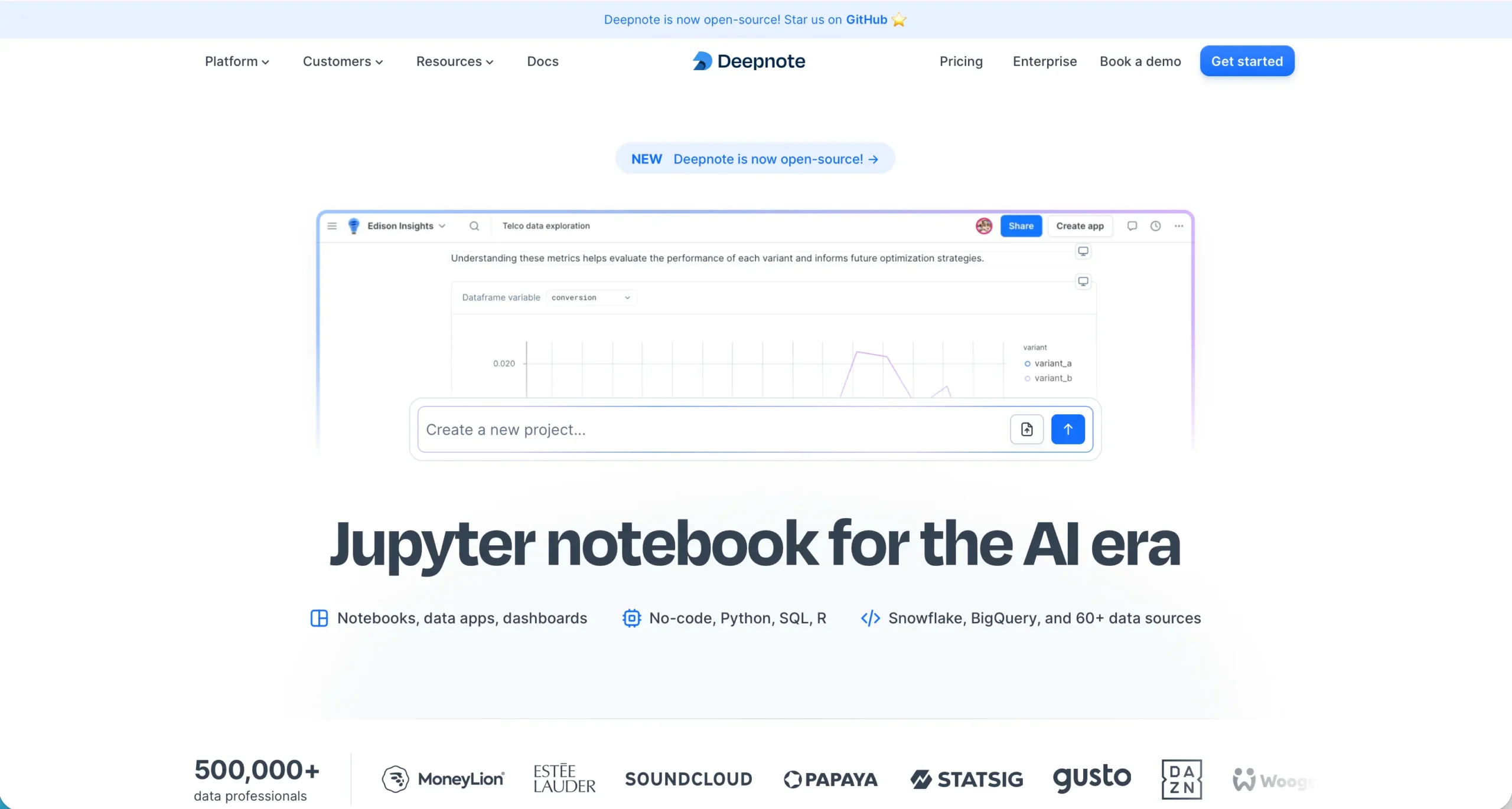
Website: https://deepnote.com
Deepnote’s website immediately conveys its identity as a collaborative data science workspace with crisp, modern design and messaging that resonates with both beginners and advanced users. The homepage highlights its core strength in real-time collaboration, showing how teams can work together on notebooks, run analyses, and share insights without the friction typical of traditional tools. Features like live editing, version history, and seamless integration with popular data sources are presented clearly with engaging visuals that reflect real workflows rather than abstract concepts. Thoughtful sections for use cases, customer stories, and platform capabilities help visitors quickly understand how Deepnote accelerates productivity for data scientists, analysts, and educators alike. With intuitive navigation, strong calls to action for signing up or exploring templates, and a clean aesthetic that balances functionality with inspiration, Deepnote’s website successfully showcases a powerful tool designed to make data work more interactive, efficient, and collaborative.
#9: Toast
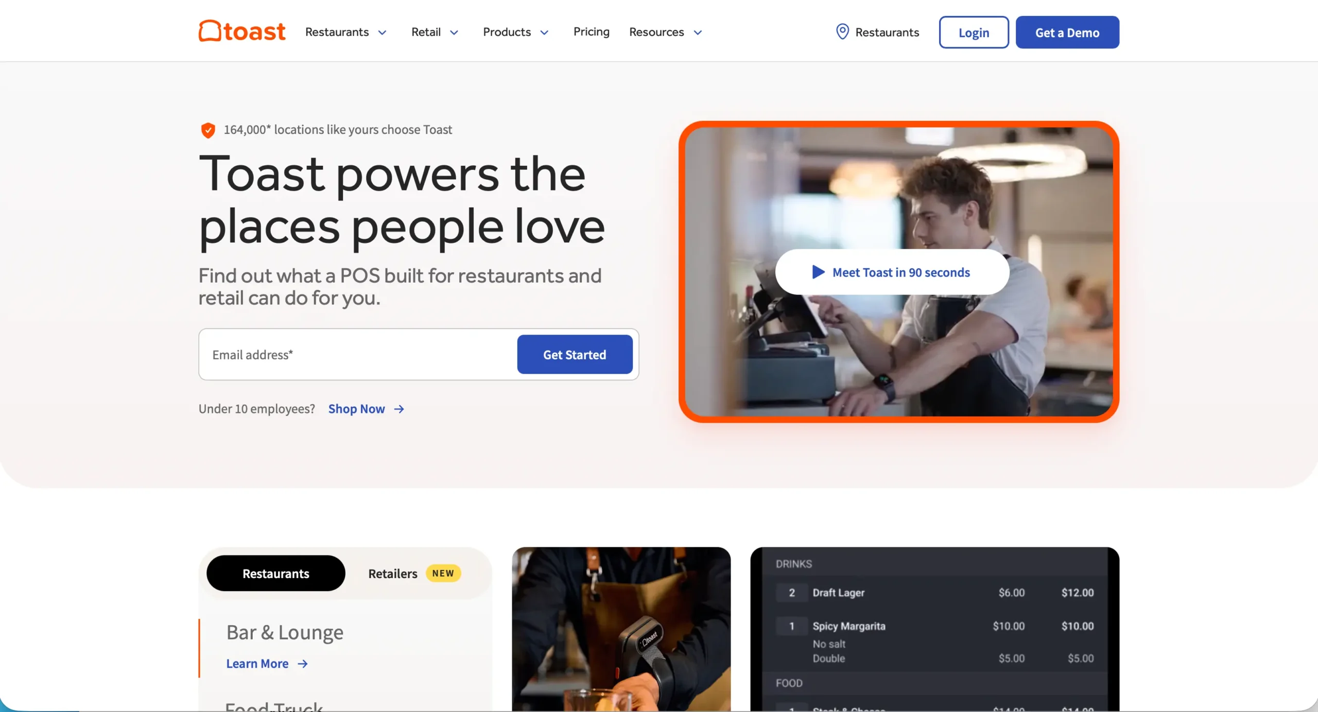
Website: https://pos.toasttab.com
Toast’s website captures attention with a vibrant, hospitality-centric design that immediately communicates its role as a comprehensive point of sale and restaurant management platform. The homepage quickly outlines key features like ordering, payments, menu management, and analytics with clear, benefit-focused messaging that speaks directly to the needs of restaurateurs and operators. Bold visuals and customer stories bring real world context to the experience, showcasing how Toast helps businesses streamline service, boost revenue, and improve guest satisfaction. Strategic use of icons, straightforward navigation, and outcome-oriented sections make it easy for visitors to explore solutions by restaurant type or operational need, whether they are running a quick service concept or a full service establishment. Strong calls to action guide users toward demos, pricing information, and success resources without overwhelming the page, creating a user journey that feels both informative and motivating. Overall Toast’s website blends energetic design with practical content, effectively reflecting the platform’s value for food service professionals.
#10: Snapdocs
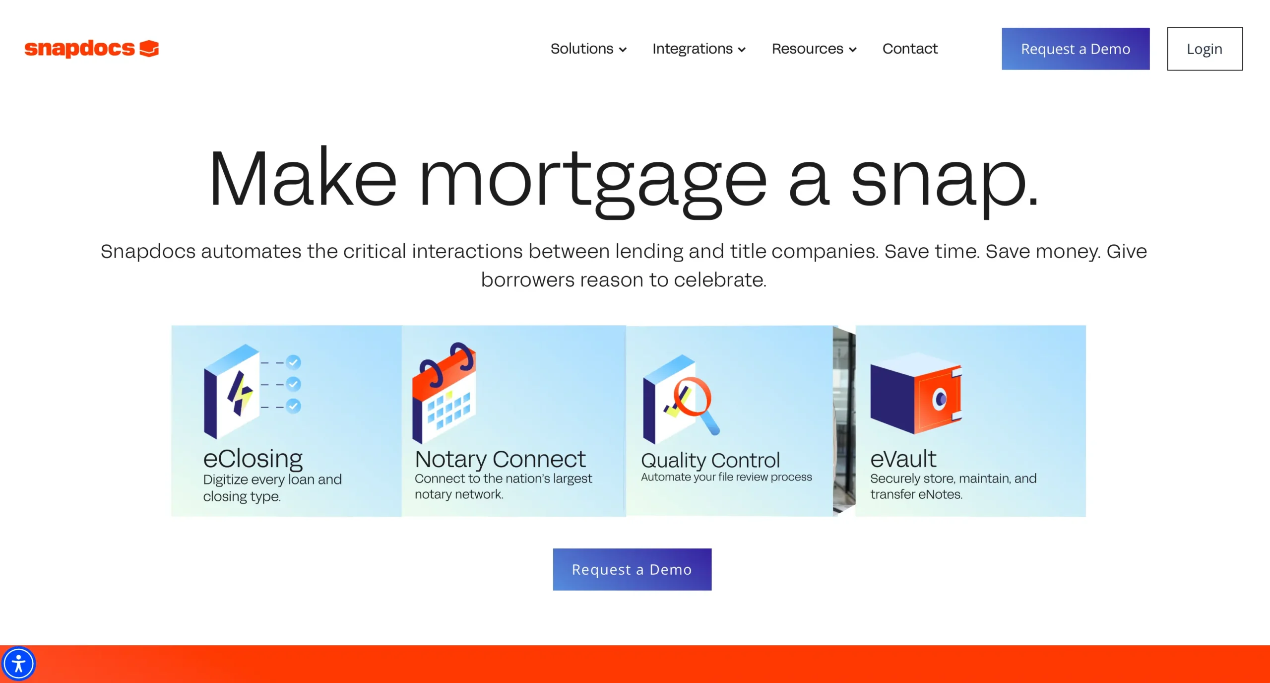
Website: https://www.snapdocs.com
Snapdocs’ website stands out with a clean, professional design that highlights its leadership in closing and loan execution technology for the real estate industry. From the first scroll, visitors are met with clear, compelling messaging about how the platform streamlines the closing process, improves communication between stakeholders, and reduces errors and delays. Strategic layout and visual hierarchy guide users through key features like digital signing, automated tracking, and real-time status visibility, making complex workflows easier to understand at a glance. Trust signals, including customer testimonials and partner logos, bolster credibility while thoughtful use cases show how lenders, title companies, and agents benefit from the solution. With intuitive navigation, persuasive calls to action for demos and resources, and a design that balances informative content with visual clarity, Snapdocs’ website effectively showcases a powerful SaaS tool built to simplify one of the most critical stages in property transactions.
Honorable Mentions
While the companies above earned top rankings for their exceptional execution, several other SaaS websites deserve recognition for pushing creative and technical boundaries. From innovative product storytelling and refined user interfaces to standout microinteractions and compelling brand narratives, these honorable mentions demonstrate that excellence in SaaS design takes many forms. Each of these websites offers unique strengths that contribute to a richer, more engaging digital landscape for modern software companies.
https://buildwithfoundation.com/