






Brand identity design services for a recognizable, usable visual system.
Your proposal, website and latest announcement should feel like they come from the same organization. WebXd helps shape the visual choices behind that connection, from the logo and typography to the layouts your team uses every week. Build a new identity or refine the one people already know, with a scope tied to the materials you need.

A visual language needs more than a signature.
A logo identifies the organization. The surrounding design gives it a consistent voice on a dense report, a short announcement or a small screen. Brand identity design brings those choices together so a new piece can belong to the family without copying an earlier layout.
A logo family
Choose the right mark for the space available. A primary lockup may suit a cover, while a compact version works in a narrow header. Define clear space, minimum sizes and background variants, then check that each version remains recognizable when it gets small.
Colors with jobs
Give each color a purpose, such as a primary background or a restrained accent. Document combinations that keep text readable, rather than leaving people to pair every swatch freely. A brand palette needs guidance for everyday content as well as a striking cover.
Type and supporting elements
Set a hierarchy for headlines, body text and labels, with examples of spacing and alignment. Graphic shapes and imagery direction should support the message. They need enough flexibility for new topics while retaining a character people can recognize across materials.
Put the idea to work before approving it.
A polished identity board can hide practical problems. We explore the proposed direction on representative materials chosen with your team. A slide with a long title, a website header and a social announcement each reveal different limits. The review should show how the system behaves under those conditions.
Same identity, different demands
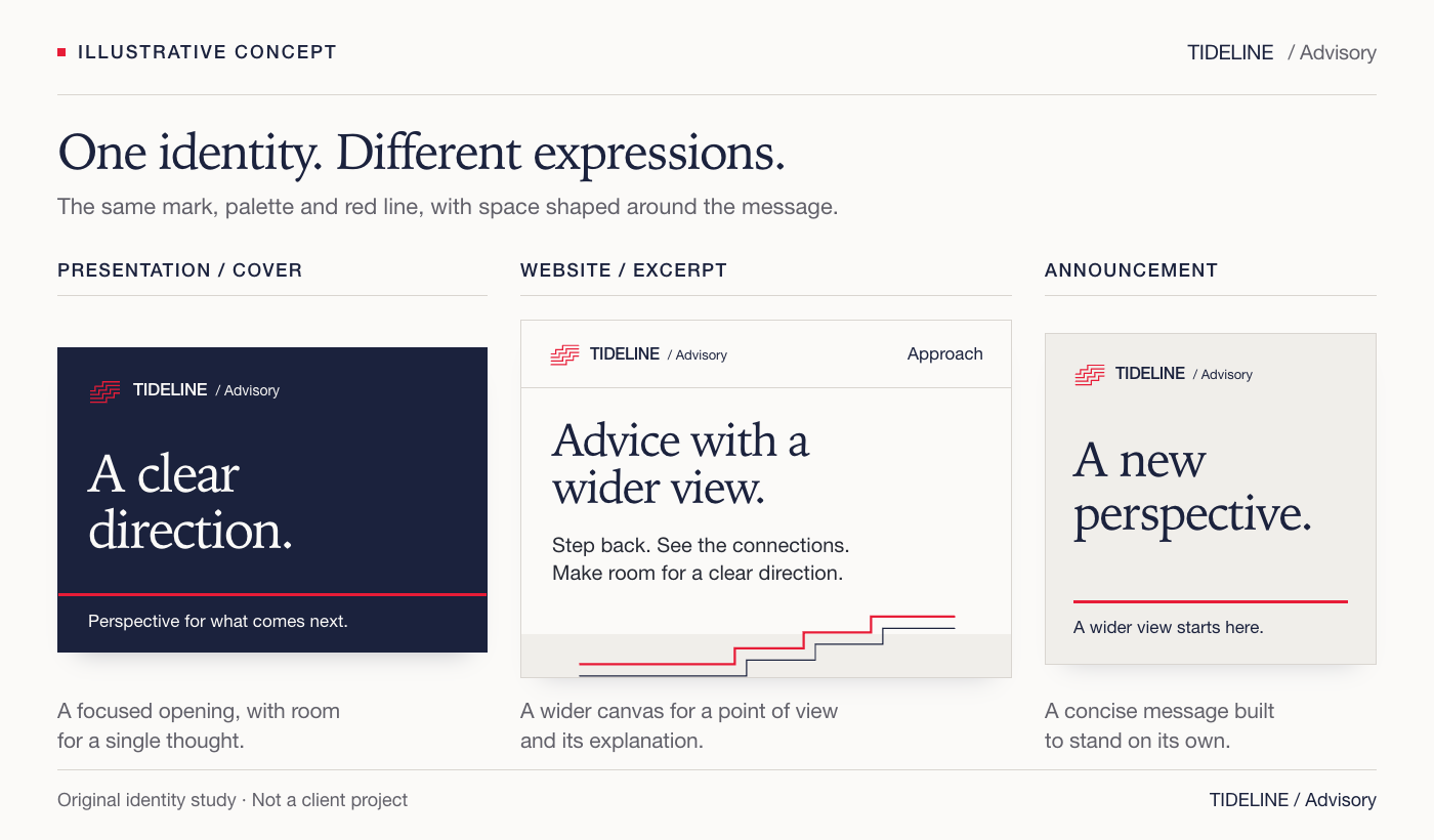
In the illustrative TIDELINE study, the red line anchors a presentation cover and a compact announcement. The website excerpt gives more space to explanatory text. The layouts change with the task, while the mark, type and color roles keep them related. These are concept applications, not examples of client results.
Useful review questions
- Does a long headline still have a clear hierarchy?
- Can the compact mark be read at the intended size?
- Are text and background pairings readable?
- Can a colleague replace the content without breaking the layout?
Feedback is easier to act on when it names the use case. If a department name does not fit, we can adjust the lockup or placement rule. If an accent overwhelms an announcement, we can refine its role. Agree on a decision maker and consolidate comments before each revision.
Decide how much identity work you need.
An organization with a useful logo may need better rules and templates. A new organization may need the whole visual foundation. We review existing materials and your intended audience before proposing the extent of change. The starting point should reflect what is useful today and what the identity must support next.
Strengthen the existing system
- Retain the approved logo and recognizable elements.
- Resolve inconsistent color, type and layout decisions.
- Create guidance and templates for recurring materials.
Refresh the visual direction
- Agree which familiar elements should carry forward.
- Refine the mark or supporting design where needed.
- Demonstrate the updated direction on priority applications.
Create a new identity
- Establish a visual brief around the audience and organization.
- Develop a logo family and a connected design language.
- Define usage rules and the initial application set.
We agree on the number of concept directions, revision rounds and applications in the proposal. Naming, extensive audience research or a change in brand architecture can expand the engagement. Raise those needs at the start so the visual work rests on decisions your stakeholders have approved.
Leave instructions someone else can use.
A brand style guide should answer the questions that arise during production. Show which logo file belongs on a dark background and what happens when a layout needs a longer title. Use examples of correct and incorrect application to explain the rules, then connect them to the actual files.
Guidelines
Document logo placement, color specifications and typography with enough detail for the agreed channels. Include image treatment and layout examples where they matter. Digital color values and print specifications serve different uses, so production requirements should be discussed with the people who will make the materials.
Editable assets and templates
The handoff can include vector logo masters, raster exports and editable templates in agreed formats. Confirm who needs to edit them and which software they use. Record font and image license requirements alongside the assets, and define ownership and usage rights in the agreement before work begins.
A working check
Ask a colleague to create a fresh piece from a template using the guide. A useful handoff makes the expected decisions clear without requiring the original designer to explain every step. Questions from that exercise can reveal a missing example or a rule that needs more detail.
Introduce the identity where it matters first.
Make an inventory of the materials people see and the files colleagues reuse. Prioritize the places where competing versions would cause confusion, such as the website header and proposal template. A rollout plan names the owner of each replacement and identifies older assets that should be retired.
- Confirm the approved identity and current source folder.
- Replace priority public touchpoints and recurring templates.
- Share the guide with internal teams and outside suppliers.
- Archive obsolete files with a clear record of their status.
- Assign a person to review future additions to the system.
Identity design sets the visual direction for a website; website design turns it into page layouts and navigation. If both are changing, coordinate the approval dates so implementation uses the agreed assets. Production of videos and campaign materials can be scoped separately around the same visual rules.
Questions about brand identity design.
Can we keep our current logo?
Yes, the scope can focus on the system around an approved logo. Bring the original files and examples of where the identity feels inconsistent. We can discuss whether typography, color roles and templates would address those issues, or whether changes to the mark need to be considered.
What affects the cost and schedule?
The extent of change, concept exploration and application list all shape the work. So do the availability of source files and the number of stakeholders involved in approvals. We define deliverables, review points and timing in the proposal, with dependencies made clear before the project starts.
Is a brand guide enough for our team?
A guide explains the rules, while a template makes a recurring task easier to repeat. If your team often creates presentations or announcements, agree on those templates as deliverables. The best format depends on the software people use and how much freedom they need when editing.
Does identity design include a website or trademark registration?
Website implementation needs its own scope, even when the identity is being created for a new site. Trademark searches, legal clearance and registration also require separate professional advice. Discuss those dependencies before approving a name or mark, and confirm the responsibilities in the project agreement.